An R function to compute Tumor Mutational Burden (TMB)

Tumor mutational (or mutation) burden, TMB, is considered a useful estimation of tumor neoantigenic load (https://www.ncbi.nlm.nih.gov/pmc/articles/PMC6336005/) and a biomarker of sensitivity to immune checkpoint inhibitors (https://genomemedicine.biomedcentral.com/articles/10.1186/s13073-017-0424-2).

Computing TMB is relatively easy. Together with a student of mine (Stefano Pezzella), I followed the approach described in the work by Chalmers and colleagues (https://genomemedicine.biomedcentral.com/articles/10.1186/s13073-017-0424-2) and wrote down a simple R function that does the job.

TMB is defined as the number of coding mutations per megabase of coding region. Luckily enough, one recent study computed the length of the coding regions of the human genome. Only considering the coding portions of exons, such length was estimated to be 25,840,698 base pairs, as shown in Table 2 of the work by Piovesan and colleagues (https://bmcresnotes.biomedcentral.com/articles/10.1186/s13104-019-4343-8)

I release here the R function to compute TMB. The function, together with a toy example, is also available on github, on the page I dedicate to the pieces of code I wrote as part of some work I did for the Clingen-fvg project (https://github.com/genomeud/clingen-fvg)

The example file has to include one column named ExonicFunc, in which the function of the variant is annotated. Intergenic variants should be listed as “.” and will be discarded. Be careful, since everything that is not “.” is not discarded, and will enter the computation. If you notice crazily high values of TMB, it is likely that in your input file the intergenic variants are represented with a different string (and you just need to change the string).


# Reference paper for the computation of TMB: 
#https://genomemedicine.biomedcentral.com/articles/10.1186/s13073-017-0424-2
library(data.table)
library(openxlsx)
#We use a literature-based proxy for length of the CDS
#https://doi.org/10.1186/s13104-019-4343-8 
cdslength<-25840698 
cdslength<-cdslength/1000000 #convert to Mbases
#Files 
snvtoread<-"Sample.muTect.somatic.snv.annovar.hg19_multianno.xls"
vars<-fread(snvtoread, data.table=F)

#Important assumption about the input files
#1) It has one column named ExonicFunc, in which intergenic mutations are annotated as "."
#   if this is not the case you will need to change the symbol in the line below
exvars<-vars[vars$ExonicFunc!=".",] 
mut_type<-table(exvars$ExonicFunc)
TMB<-sum(mut_type)/cdslength

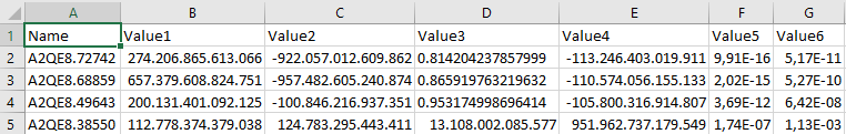
The final object generated by the function is named TMB and represents the estimate of the Tumor mutational burden.

Chi subisce il caro-carburante?

Oggi mi sono imbattuto in un nuovo tweet di Fratelli d’Italia che sosteneva che il taglio delle accise del 2022 fosse andato a favore dei più ricchi.

Premetto che, data la totale assenza di riferimenti a dati reali, è impossibile verificare questa informazione. Però è possibile fare un ragionamento diverso, e cioè. A seguito dell’eliminazione degli sconti, chi sarà colpito maggiormente: i redditi bassi oppure i redditi alti?

Come sempre, faremo dei semplici esempi in R. Fissiamo dapprima un prezzo del carburante per il 2022 e uno per il 2023; in modo puramente indicativo, usiamo per il 2022 il prezzo con sconti sulle accise, fissato arbitrariamente in 1.6 € al litro. Per il 2023 usiamo il prezzo dopo l’eliminazione degli sconti, fissato arbitrariamente in 1.8€ al litro.

Questi valori sono arbitrari, e servono semplicemente come scenario di prezzo del carburante basso e prezzo elevato, rispettivamente.

prezzo.2023<-1.8
prezzo.2022<-1.6

Creiamo poi due scenari di salario abbastanza estremi: un salario elevato (3000 € al mese) e uno basso (1000 € al mese).

sal.alto<-3000
sal.basso<-1000

Inoltre, giusto per aumentare la nostra abilità di esplorare i possibili scenari, immaginiamo un uso elevato di carburante (50 litri al mese) e uno basso (10 litri al mese).

uso.elevato<-50
uso.basso<-10

Una nota: tutte queste variabili possono essere cambiate a piacimento e poi usate con il codice seguente per esplorare possibili situazioni. Per questo motivo ho scelto di usare una variabile anche per numeri brevi. La fatica di scrivere un nome di variabile (ad esempio “uso.elevato”) anziché il semplice numero 50, è ripagata quando per giocare cambio il valore della variabile e posso riutilizzare il codice sottostante senza cambiare nemmeno una virgola.

Detto questo, mi calcolo il costo mensile del carburante per gli anni 2022 e 2023 nel caso di consumo basso e di consumo elevato. Creo anche due vettori, uno per il costo in caso di basso uso di carburante, e uno per il costo in caso di alto uso. Questo serve per facilitare le operazioni successive.

costo.2023.uso.elevato<-uso.elevato*prezzo.2023
costo.2023.uso.basso<-uso.basso*prezzo.2023
costo.2022.uso.elevato<-uso.elevato*prezzo.2022
costo.2022.uso.basso<-uso.basso*prezzo.2022
costi.uso.basso<-c(costo.2022.uso.basso,costo.2023.uso.basso)
costi.uso.elevato<-c(costo.2022.uso.elevato,costo.2023.uso.elevato)

Adesso calcoliamo quanto incide in percentuale il costo del carburante sullo stipendio, in caso di stipendio elevato e in caso di stipendio basso.

incidenza.sal.alto.uso.basso<-100*costi.uso.basso/sal.alto
incidenza.sal.alto.uso.alto<-100*costi.uso.elevato/sal.alto
incidenza.sal.basso.uso.basso<-100*costi.uso.basso/sal.basso
incidenza.sal.basso.uso.alto<-100*costi.uso.elevato/sal.basso

E finalmente, possiamo disegnarci il grafico! Iniziamo con l’uso di base R

#Scegliamo dei bei colori
mycolors<-c("firebrick1","dodgerblue1")
par(mfrow=c(2,2))
barplot(incidenza.sal.basso.uso.basso,col=mycolors,ylim=c(0,8),ylab=paste("Incidenza % su salario di",sal.basso,"€"),main=paste("Consumo",uso.basso,"km mensili"))
barplot(incidenza.sal.basso.uso.alto,col=mycolors,ylim=c(0,8),main=paste("Consumo",uso.elevato,"km mensili"))
barplot(incidenza.sal.alto.uso.basso,col=mycolors,ylim=c(0,8),ylab=paste("Incidenza % su salario di",sal.alto,"€"))
barplot(incidenza.sal.alto.uso.alto,col=mycolors,ylim=c(0,8),legend.text=c(2022,2023),args.legend=list(fill=mycolors,bty="n"))

Proviamo a fare la stessa cosa usando ggplot.

incidenza<-data.frame(Anno=rep(c(2022,2023),4),
    Variable=c(rep(paste("Salario",sal.alto,"€,",uso.basso,"litri al mese"),2),
                    rep(paste("Salario",sal.alto,"€,",uso.elevato,"litri al mese"),2),
                    rep(paste("Salario",sal.basso,"€,",uso.basso,"litri al mese"),2),
                    rep(paste("Salario",sal.basso,"€,",uso.elevato,"litri al mese"),2)),
    Value=c(incidenza.sal.alto.uso.basso,incidenza.sal.alto.uso.alto,incidenza.sal.basso.uso.basso,incidenza.sal.basso.uso.alto))

ggplot(incidenza,aes(x=factor(Anno),y=Value,fill=factor(Anno))) +
 facet_wrap (~ Variable) + #Creiamo 4 grafici, uno per ogni valore di "Variable" 
 geom_bar (stat="identity") + #Vogliamo un barplot che riporti i valori da noi forniti
 labs(fill="Anno",x="",y="Incidenza % su stipendio") #Estetica sulla legenda

Le conclusioni sono abbastanza evidenti. Un cittadino con salario mensile di 1000€, spende l’8% del suo salario mensile per comprare 50 litri di benzina al prezzo di 1.6 € al litro, e il 9% del suo salario nel caso in cui il prezzo sia 1.8 € al litro. Un cittadino con salario mensile di 3000€, spende il 2.7% del suo salario mensile per comprare 50 litri di benzina al prezzo di 1.6 € al litro, e il 3% del suo salario nel caso in cui il prezzo sia 1.8 € al litro.

Il vero prezzo del carburante

Tutto ha avuto inizio da un tweet di Fratelli d’Italia che riportava questo grafico:

Vedendo il grafico stesso, chiunque direbbe che in questo inizio 2023 i prezzi del carburante sono decisamente scesi. Eppure, noi tutti ci ricordiamo di aver fatto il pieno a Dicembre 2022 con prezzi ben inferiori a 1.8 al litro. Come mai?

Semplice, perché questo grafico, furbescamente, NON riporta i dati da Settembre a Dicembre 2022!

Ho quindi pensato di investigare la faccenda. Come spesso accade, per amore della riproducibilità, ho fatto tutto in R e vi lascio il codice qui, così chi vuole giocare può farlo liberamente.

Il primo passo, è stato trovare una fonte autorevole per i prezzi del carburante. Sul sito governativo del MISE (https://dgsaie.mise.gov.it/open-data) si trovano i grafici relativi all’andamento, ma anche (cosa lodevole) i dati grezzi da scaricare.

#Carichiamo le librerie necessarie
library(data.table)
library(gplots)
#Link per scaricare i dati settimanali di prezzo dei carburanti dal sito del MISE
weekly.data<-"https://dgsaie.mise.gov.it/open_data_export.php?export-id=4&export-type=csv"
dati<-fread(weekly.data,data.table=F)
#Scegliamo solo la benzina, per il momento
dati<-dati[dati$NOME_PRODOTTO%in%"Benzina",]
#Per motivi che ignoro, il prezzo sul sito del mise è riportato come prezzo di 1000 litri. Per il prezzo al litro dobbiamo dividere per 1000
dati$PREZZO<-round(dati$PREZZO/1000,2)
#Poiché nel dataset non è presente un campo per il solo anno, me lo creo io
dati$ANNO<-as.numeric(substr(dati$DATA_RILEVAZIONE,1,4))
#Stessa cosa con il mese. Ci aiuta il fatto che ad esempio Gennaio è scritto come 01, per cui si tratta sempre della posizione 5 e 6 della stringa
dati$MESE<-substr(dati$DATA_RILEVAZIONE,6,7)
#Ci creiamo variabile MESE_ANNO, da usare per il grafico
dati$MESE_ANNO<-paste(dati$MESE,dati$ANNO,sep="_")
#Selezioniamo solo 2022 e 2023
dati<-dati[dati$ANNO>=2022,]
#Aggreghiamo per mese
dati.mese<-aggregate(dati[,c("PREZZO","ANNO")],by=list(dati$MESE_ANNO),FUN="mean")
#Aggregate cambia nome alla variabile usata come chiave. Noi, che siamo duri, rimettiamo il nome giusto
names(dati.mese)[1]<-"MESE_ANNO"
#Ordiniamo prima per anno e poi per mese
dati.mese<-dati.mese[order(dati.mese$ANNO,dati.mese$MESE_ANNO),]
dati.mese$col<-"blue"
dati.mese$col[dati.mese$ANNO==2023|dati.mese$MESE_ANNO>"09_2022"]<-"red"
#Impostiamo l'asse y sullo stesso valore osservato sul grafico di Fratelli d'Italia
ext.prezzo<-c(1.65,2.1)
barplot2(dati.mese$PREZZO,ylim=ext.prezzo,names.arg=dati.mese$MESE_ANNO,las=2,xpd=FALSE,cex.axis=0.9,col=dati.mese$col)

Si nota pertanto che la cosiddetta “finanziaria Meloni”, al contrario da quanto dichiarato da Fratelli d’Italia, ha riportato il prezzo a valori decisamente più alti, anche se non così alti come i temibili mesi estivi del 2022.

Nota: il prezzo medio di Gennaio è parziale, e contiene anche il dato del primo Gennaio 2023, quando l’aumento non era ancora stato registrato dal MISE, e pertanto è soggetto ad ulteriori aumenti. Aggiornerò (forse) il grafico, ma chi vuole può correre la funzione di R sui dati aggiornati e avere un grafico sempre aggiornato.

Navigating folders in RStudio: a beginner’s guide

In this brief tutorial we will discuss how to navigate through folders in RStudio.

When you open RStudio, the software will also open an instance of R. As any other software, when opened R is set to read and write files in a default location, which much likely is not the location in which you want to save your data.

In my case, the default folder is my Documents directory.

Let’s now assume dat you have to read the file named iris.csv, that is located in the folder shown below.

You have to change folder. It is pretty easy: Session -> Set Working Directory -> Choose Directory (note the shortcu, if you are a shortcut fan).

You can then navigate to your folder (e.g. my work) easily, and click on Open

After this, you will get notified of the directory change, and you can finally, easily read your file.

I get the chance for a slightly more advanced thing. If you set your directory to “my_work” as I did, and your file is in “my_work/data”, you have to read the file “data/iris.csv”. If you try to read the file “iris.csv” without specifying the directory you will get an error.

The more careful readers may have noticed that, after changing the folder, and without any typing on our side, the text

setwd("C:/Users/marroni/Desktop/tmp/my_work")

appeared. Well, this is how you change directory in R, and I suggest you get acquainted to that. It is very easy. In Windows it is simply: setwd(“D:/folder/that/you/want”) where D is the name of the drive.

You may ask: do I REALLY have to type the “data” folder name to read my iris.csv? Well, this is not necessary. You can navigate to the “data” folder and then simply type the file name, as I show below:

Well. This is all. Setting working directories is a very important task in R, and you can find many tutorials (all better than mine!) on the internet. I suggest you take your time to learn and become confident in setting working directory in R.

Come cancellare le foto di whatsapp

In questo breve tutorial vedremo come cancellare le foto di whatsapp dal telefono. Il tutorial è stato testato su Samsung Galaxy A30s.

Innanzitutto, individuare la App “Archivio”. La potete cercare tra le applicazioni Samsung, oppure usare la casella di ricerca delle app, come mostrato in figura.

La app ha in genere il simbolo di una cartella (Vedere sotto).

Una volta aperta la app dovreste trovarvi di fronte una schermata di questo tipo, nella quale basterà selezionare la dicitura “Immagini”. NB: Possiamo fare esattamente la stessa operazione con i video.

Una volta premuto su “Immagini”, se siete sfortunati, vi comparirà una schermata come la seguente:

Nessuna paura! Basta premere sull’icona della cartella mostrata nel cerchio rosso qua sopra, e come per magia la vostra schermata diventerà come quella mostrata sotto, con le immagini suddivise per provenienza.

Adesso potete concentrarvi sulla cartella WhatsApp Images e sfogare su di essa le vostre manie di pulizia. Buone pulizie!

Nice tables in R

I used to think that making nice table in R is not worth the effort. However, after changing my mind for the billionth time on relatively large tables for a paper and do not wanting to reformat them again from scratch, I gave a try to the formattable package, and I liked it very much.

I post here some basic formats I learnt from the web.

Note: I usually work on remote servers with no/limited graphical capabilities (no X11, basically), and for me the formattable function doesn’t work. I use the format_table instead and write the html code to a file, which I then open. However, I never noticed differences in the behavior of format_table from what more expert users showed for fromattable.

Let’s create a table:


library(formattable)
library(knitr)
outfile<-"test.html"
data<-data.frame(id=1:10,x=round(rnorm(10,100,25)))
myhtml <- format_table(data)
write(myhtml,outfile)

This is the output

Raw html table

Ok. It’s a table. I want to change the fonts, the font size, AND format the cell based on their values. It’s possible, but it was not easy for me to find a way to do that. See my post on stackoverflow with link to the demo where formattable author showed how to do that.

I will create two formatters.

font_and_grad is changing the fonts and coloring the cells with a gradient of colors based on cell values.

font_and_bar is changing the fonts and coloring the cells with a bar of a given color, with bar length based on cell values.


font_and_grad <- formatter("span",
style = x ~ style(
display = "block",
direction = "rtl",
"border-radius" = "4px",
"padding-right" = "2px",
"background-color" = csscolor(gradient(as.numeric(x),min.color="yellow",max.color="darkorange")),
"font-family" = "verdana",
"font-size" = 10))

font_and_bar <-formatter("span",
style = x ~ style(
display = "inline-block",
direction = "rtl",
"border-radius" = "4px",
"padding-right" = "2px",
"background-color" = csscolor("lightgreen"),
width = percent(proportion(x)),
"font-family" = "verdana",
"font-size" = 10))

myhtml <- format_table(data, list(id=font_and_grad,x=font_and_bar))
write(myhtml,outfile)


Table_02

Now, the only horrible thing left are the header fonts. I had troubles accomplishing this, and at the end I decided that I would simply change the html code.


myhtml<-gsub("
<th style=\"text-align:right","<th style=\"font-family: verdana; font-size: 10; text-align:right",myhtml)

write(myhtml,outfile)

Table_03

Maybe not the best approach, but it worked! Another approach has been suggested on stackoverflow, but it wasn’t very well suited for me. As usual, comments and suggestions are welcome.

Separatori decimali e migliaia in excel, libreoffice, e R

Accade spesso di ricevere o spedire una tabella excel (o di testo, che comunque viene poi aperta con excel) da un collega che ha impostazioni dei separatori decimali e delle migliaia diverse dalle nostre. Il file, aperto con un editor di testo, ha il seguente aspetto:

Separatori_Orig_File

Se invece provate ad aprirlo con Excel, il risultato, è che uno dei due vedrà il file in maniera uqasi incomprensibile, come mostrato sotto.

Separatori_Orig_Excel_File

Premessa: io ho sempre utilizzato il punto come separatore decimale e la virgola come separatore delle migliaia, credendo che esso fosse lo standard internazionale. Con mio disappunto ho invece scoperto che entrambe le notazioni sono ammesse. In altre parole, un mezzo può essere scritto 0.5 o 0,5. In genere le nazioni europee utilizzano la virgola come separatore decimale e il punto come separatore delle migliaia, mentre le nazioni anglosassoni e la Cina fanno l’opposto. Va precisato che tutte le riviste scientifiche richiedono il punto come separatore decimale e la virgola come separatore delle migliaia. Suggerisco perciò a chiunque lavori in ambito scientificio di adeguarsi a questa modalità.

Ciò detto, cambiare tra i vari standard è molto semplice, vediamo di seguito come fare.

Excel 2016

Se il file che avete ricevuto ha l’aspetto di quello mostrato sopra, probabilmente avete ricevuto un file in cui il punto è usato come separatore decimale e il vostro Excel ha la specifica opposta. Per visualizzare correttamente il file dovete agire come segue. Innanzitutto chiudete il file ed aprite un file vuoto in Excel. Selezionate la voce File, in alto a sinistra. Si aprirà un afinestra, sul cui lato sinistro avrete varie voci. Selezionate quella più in basso, “Opzioni”; si aprirà una nuova finsetra. Selezionate “Impostazioni avanzate” e vi troverete di fronte una vista come quella sotto.

Opzioni_Excel_01

A questo punto, vi basterà assicurarvi che  il separatore decimale sia un punto come nella foto sopra e quello delle migliaia sia una virgola. Adesso quando aprirete il file, esso si aprirà correttamente, come mostrato sotto.

Separatori_Orig_Excel_File_Final

Unica nota dolente: ogni volta che ricevete un file con specifiche diverse dalle vostre, al fine di visualizzarlo correttamente dovrete ripetere la procedura.

Libreoffice (6.1)

In Libreoffice, la gestione è simile a quella di Excel ma, per quanto ho avuto modo di constatare, ancora migliore. Infatti, anche nella sfortunata situazione in cui le vostre specifiche siano diverse da chi vi ha inviato il file, Libreoffice sarà in genere abbastanza intelligente da utilizzare i separatori appropriati. Io ho fatto la prova di forzare i separatori all’italiana così: in libreoffice calc (l’equivalente di excel) scegliere la voce Strumenti e da lì Opzioni, si aprirà una finestra in cui dovete scegliere Impostazioni della Lingua, Lingue. Io di solito tengo Stati Uniti come impostazione locale, in modo da avere il punto come separatore decimale. In questo caso, ho messo Italia, in modo da avere la virgola come separatore decimale, come mostrato sotto.

Separatori_Libreoffice_comma

Nonstante ciò, se apro il file di  testo di cui sopra, in cui il separatore decimale è il punto, esso viene aperto correttamente da Libreoffice, come mostrato sotto.

Separatori_Libreoffice_Results

Una nota: non ho fatto test estensivi, ma sono abbastanza sicuro che esistano situazioni in cui libreoffice possa confondersi con i separatori, per cui  suggerisco sempre di dare uno sguardo.

R

Infine, per chi (come me) è un fornitore di dati ottenuti con R, è possibile decidere quale separatore usare una volta che si salva il file. Mi sembra incredibile aver aspettato anni prima di impararlo, ma è veramente facilissimo. Immaginiamo che abbiate il data.frame dei risultati (chiamato, con una botta di fantasia, “results”) pronto da salvare, ma i vostri collaboratori che lo riceveranno hanno excel con la virgola come separatore decimale. Vi basterà eseguire il seguente comando prima di salvare su file, e il gioco è fatto.


newresults<-format(results,decimal.mark=",")

Tenendo presenti tutte queste possibilità, la conversione tra formati sarà un gioco da ragazzi!

Use R to write multiple tables to a single Excel file

The possibility of saving several tables in a single file is a nice feature of Excel. When sharing results with colleagues, it might be useful to compact everything in a single file.
As a bioinformatician, I am too lazy to do that manually, and I searched the web for tools that allow doing that.
I found out that there are at least two R packages that work well: xlsx and openxlsx.
First of all, let’s install the packages.

install.packages(c("xlsx","openxlsx"))

Now, let’s try to write some random stuff using openxlsx.

start_time <- Sys.time()
library(openxlsx)
of="example_1.xlsx"
OUT <- createWorkbook()
for(aaa in 1:20)
{
mdf<-data.frame(matrix(runif(n=1000),ncol=10,nrow=100))
sname<-paste("Worksheet_",aaa,sep="")
addWorksheet(OUT, sname)
writeData(OUT, sheet = sname, x = mdf)
}
saveWorkbook(OUT,of)
end_time <- Sys.time()
end_time-start_time

Running time on my machine is around 3 seconds.
Now let's try to save some very similar random stuff using xlsx


start_time <- Sys.time()
library(xlsx)
of="example_2.xlsx"
for(aaa in 1:20)
{
mdf<-data.frame(matrix(runif(n=1000),ncol=10,nrow=100))
sname<-paste("Worksheet_",aaa,sep="")
ifelse(aaa==1,app<-"FALSE",app<-"TRUE")
write.xlsx(mdf,file=of,sheetName=sname,row.names=FALSE,append=as.logical(app))
}
end_time <- Sys.time()
end_time-start_time


Running time is approximately 25s.

It looks like openxlsx is much faster than xlsx, and so I currently prefer it.
If you try to use openxlsx to save with the name of an existing file, you will get an error message.

saveWorkbook(OUT,outfile)
Error in saveWorkbook(OUT, outfile) : File already exists!

This might be useful if you want to be sure you never overwrite files by mistake, but it can also be annoying. To avoid this error message and allow overwriting of files, you just have to use the following command:

saveWorkbook(OUT,outfile,overwrite=TRUE)

Edit:

Thanks to comments from Roman and code from Mihal, it was very easy to also test a third option, writexl.

Code below:

start_time <- Sys.time()
library(writexl)
of="example_3.xlsx"
sheets<-list()
for(aaa in 1:20)
{
mdf<-data.frame(matrix(runif(n=1000),ncol=10,nrow=100))
sname<-paste("Worksheet_",aaa,sep="")
sheets[[sname]]<-mdf
}
write_xlsx(sheets,of)
end_time <- Sys.time()
end_time-start_time

Running time is less than 2 seconds.

Wow, how many option for writing excel files. And I still have to try XLConnect, as suggested by Ellie!

Note: I had an experience (which I am no longer able to reproduce, and maybe I am not remembering well!) of openxlsx being unable to save files that xlsx could save without any problem. With this in mind, I kept note of both approaches, hoping that at least one would work in any situation!

Stouffer’s meta-analysis with weight and direction effect in R

I often have to perform meta-analysis of past experiments for which the only info I have is the fold change and the p-value (of any measure you may imagine: species richness, gene expression, depth of coverage, plates of carbonara eaten in 5 minutes, everything).
The hardest thing to find out for me was how to take the direction of the changes into account. E.g. if monday I eat 10 carbonara more than my brother (p=0.01), on tuesday 10 more (p=0.01), on wednesday 5 more (p=0.1), on thursday 10 less (p=0.01), on friday ten less (p=0.01) and on saturday 5 less (p=0.1), a standard Stouffer meta-analysis would return a highly significant p-value, completely disregarding the fact that the significant changes were half in my favor, and half in favor of my brother.
How can I take into account the information on the direction?
I had no idea on how to proceed, and I wasn’t able to find any reference (I am not an expert of meta-analysis), but then I was so lucky to stumble upon the manual page of the software package METAINTER for performing meta-analysis.

The authors described there a method to perform Stouffer meta-analysis accounting for the direction of the effects. Their explanation was so clear that it was easy for me to write a simple function in R: I paste it below.

signed.Stouffer.meta <- function(p, w, sign) { # p is a vector of p-values
if (missing(w)) {
w<-rep(1, length(p))/length(p)
} else {
if (length(w) != length(p))
stop("Length of p and w must equal!")
}
if(length(p)==1) Zi<-qnorm(p,lower.tail=F)
if(length(p)>1)
{
Zi<-qnorm(p/2,lower.tail=FALSE) 
Zi[sign<0]<-(-Zi[sign<0])
}
Z<-sum(w*Zi)/sqrt(sum(w^2))
p.val <- 2*(1-pnorm(abs(Z)))
return(c(Z = Z, p.value = p.val))
}

How to cut an mp3 audio with Audacity

Here I will explain how to cut an mp3 audio file using Audacity. Audacity is a fairly simple sound recording/editing software available on Ubuntu and Windows.
For non experts (like me) Audacity is a friendly tool to cut mp3 to the desired sound regions.
Here are the steps.

1) Open Audacity. Select File -> Open, and then browse the file you wish to cut (test.mp3 in this case)
2) With the mouse, go over the region showing the song length. Imagine you want to cut from minute 2:25 to minute 3:00 (approximately!). Position the cursor on minute 2:25, left click, then drag the mouse to minute 3:00. The region will be grey (see Figure).
Figure 1
3) Now just press CTRL-X and the region will be cut from the file!
Figure 2
4) At this point you can save the project or export the file as an mp3 as you will normally do for any sound record (File -> Save Project or File -> Export Audio…) and you will have the cut file on your PC.